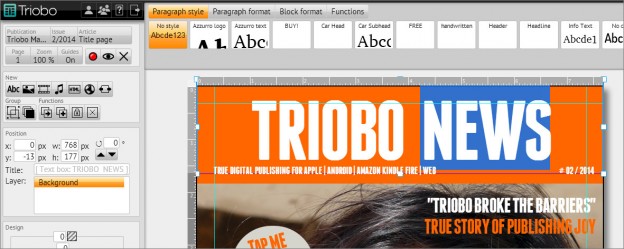
We are introducing you to a new 2.0 version of the Triobo editor. The most important change is the content generation: we have improved the experience of readers, namely in three immediate levels. Because of this it makes magazine reading faster, faster, faster.
What you should know before start using version 2.0
Before we give you a description of all the news in version 2.0, we need to mention these major changes:
Article previews
The new reader version (iOS labeled TA13, Android labeled 20) assumes that on the distribution server, previews of articles are generated (in the form before starting the animation). If not found, use the ordinary article preview (after the animation) which was previously used with the content. In case you are using the input animation in the articles, you must re-publish the issue again in the new editor version. Reading devices will then recognize the changes and automatically download the missing (and possibly modified) source.
Photo gallery
While it was previously possible to include in your gallery only those pictures that were used in your article, now you may freely organize pictures in your galleries. The original galleries were automatically transferred to the new versions. Please read the article in the Knowledge Base: Automatic photo gallery.
Publishing
During publishing, the editor newly prepares up to three versions of articles and resources. This operation can be time consuming, so now you can disable the resources optimization function through publishing to Triobo Reader. See more in the Issue Publishing article.
Sources used in HTML
When publishing sources that were used in articles, they are being sent to the distribution server. However, if you are using a custom embedded HTML code that uses its own resources it is necessary to somehow mark them. See Obligatory sources.
So what does the 2.0 version bring?
The 2.0 version brings optimization and increased performance on three levels:
- The reading device continuously preloads articles in full quality, but when the reader scrolls too quickly, then previews are displayed first. This makes it much easier for the reader to find a searched article. Once the reader stops at the article, the HTML version of the content is loaded in the highest possible quality and the input animation starts.
- We have significantly simplified the HTML code describing individual articles – in some cases the number of frames (DIV) fell by half. Thanks to this, the page loads faster, even on slower Android tablets and the reader requires less operational memory.
- The most important thing is image optimization: each used image is scaled down and cropped before publishing, to a size that is used in the article. Additionally, its version for SD resolution (standard tablets) and HD (tablets with a resolution retina) is sent to the distribution server. Also If you are preparing the mobile page layout, then these images are optimized separately. Therefore each reading device downloads images individually. Because the viewer does not need to edit images in a reader any more, the article rendering is faster than ever before.


 Try for free

